Web Strategists, I wanted to thank you all for being so involved in the comments, reading, and sharing the Web Strategy blog over the past years. As you often hear me discuss how orginizations must involve their own customers and marketplace involved in their feedback loops, I want to also live that as best as I can. I’m embarking on yet another blog redesign, working with Engage Sciences (Design), and Mitch from StudioNashVegas (Development, in the next phase), to build the next generation of this website. As I’ve done in the past, I always want to involve you, the customers, as part of the feedback loop.
I’d love your feedback in the following three comps, using discussion points loosely around the required JJG’s Five Elements of UX which I’ve adopted many times:
- Look and feel: Branding. Out of the three comps, which one best fits my brand and that of the community?
- Interface and Interaction design: Does it look easy to use some of the interactive pieces to find and navigate to information?
- Information Design: In the classical IA sense, is the information displayed in a way that makes it easy to read, find, and consume?
The other 2 elements (content and strategy) remain constant from previous posts, but you can see the below comps have a greater focus on the content assets (speeches, reports, webinars, slides, infographics) beyond just text.
Here’s three distinct comps for your review:
(note: I updated so when clicking on thumbnail you are advanced to full size image)
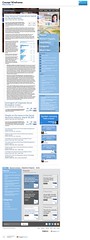
Wireframe 1: Professional personal brand. This design would feature more of the ‘personal brand’ or ‘career brand’ as I prefer to say, and could have more pictures of me. While I’m a bit bashful to push that too hard (as I’d rather have the focus be on content, not me) it’s a concept the team wanted to try. You can see this variation that has images as the BG, but I worry about sending the wrong message (larger than life ego) and of course readability.
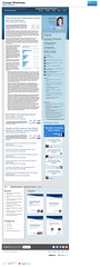
Wireframe 2: Corporate Ready: True to my business focus, and those I serve in the world’s largest corporations. The navigation elements are easier to use and centralized, and there’s dedicated features for reviewing content assets towards the bottom. Also notice the decreasing ‘content funnel’ with the latest post in largest form, then they reduce in size as older content decrescendos.
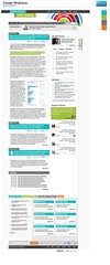
Wireframe 3: Fresh and Friendly. This one is a real departure from the others shown, or anything done to date. While the color palette can easily be changed, the goal is to really allow fresher perspective that’s warmer and inviting, and using a different layout. Assume the ‘colored fan’ would be replaced by a graphical element suitable for the overall brand, that’s just a placeholder.
You can see all the wireframes here in the full flickr set, provided by Engage Sciences team.
I really look forward to your feedback below, I’ll read and respond to as many comments as possible, as well as the design and development team. We’ll make some final tweaks based on your feedback then move into development cycles and prepare for dev testing then production launch.

I really liked the first and the third wireframes, the first one is really “nice” to the eyes and looks easy to use and find what I´m looking for. The image in the background breaks the serious appearance and makes me feel more comfortable to interact and read the blog. The “upcoming event” and the “search article” in the top of the page would be nice adds.
The third is more about the colours, and the way it highlights the important information, it claims for your attention and I really like that way of showing information.
That´s it, regards from Brazil.
I really on your blog for information; 2C provides the cleanest approach to that; I am more likely to spend time here than in the graphically busy, other versions.
I think you should go with Wireframe 1: professional personal brand. Color looks consistient, font is modern, business card avatar-thingy in the top right with social links, topics are easy to navigate. Second place goes to Wireframe 2.
Design 3 has the most modern feel, which is obviously good when talking about the web. It’s fresh and takes things in a new direction. 3B is the better colour scheme. If it incorporated the larger headings from Design 2 then win win!
3C – easy access to all types of information in your blog (both reports and posts) and the most friendly layout.
Hi Jeremiah!
Suggest to scrap 2C as it looks too similar to a LinkedIn profile page/identity.
I prefer the banner design concept in 3C to that in 1C – the 3C graphic concept in the upper banner relates to some of the modelling frameworks you employ and create in your IP. The graphic in 1C is not evident in its meaning/concept and relation to your subject matter expertise (and is less sophisticated).
I also prefer a multi-color pallet as in 3C to a single color (blue) pallet in 1C. The colors can be employed to denote your distinct themes/topics or areas of content. My only comment for improvement is to stick to the color pallet in the graphic employed in the upper banner – as is now the graphic employs colors that are not in the pallet.
Net – 3C is my recommendation with refinements to the colors in the graphic on upper banner.
Best Regards Always – you are brilliant!
Michelle Corsano
@mcorsano:twitter
Been reading all the comments. Many like 3. The most recent discussion is interesting. But for me, a simple direct answer is I like Wireframe2. Thanks for getting your readers get involved on this.
Sans serif is hard to read, this is a fact. And compact text blocks, too.
Sans serif is hard to read, this is a fact. And compact text blocks, too.
Hi Jeremiah
I am maybe coming to this late and maybe my two comments were considered and moved on from:-
1/. Why show the entire content of the latest post? It uses 80% of your real estate. Surely you could write a version that gives a synopsis
2/. In my humble opinion ( I’ve been in digital one way or another since 92) there are way to many repeated start points for the same user journey.  Â
Design 3 has the most modern sense, which is obviously good at the site. It’s fresh, and in a new direction of things. 3B is a better color scheme. If it is incorporated into a larger title from “Design” 2.