I’m having good success working with StudioNashVegas, and based on your feedback from a while ago, we’ve slowly made the changes you’ve suggested. Being a community guy, I’m working with you all to decide on what’s best for the upcoming redesign –of course, I factor in the feedback, but I make the executive call, or we’ll be doing death by committee.
While I’m 90% confident the comp is where I want it to be as far as user interface and information architecture, part of my work as a social analyst is to experiment with the different tools out there, so I’m going to use CROWDspring to outsource creation of my header. The designers will keep the logo, and will be given the dimensions to use for the header, more news on that soon (Update: here’s the details). This is a controversial topic, as I’ve written about why it’s here to stay, and I’ll be in one of the main stages at SXSW to debate it.
I’d like to get your feedback on this second iteration of the comp, I take your feedback seriously. Even if you see someone who’s said something similar to you, please chime in the comments, as I put weight on frequency of mentions.
Remember, it’s not just me that has to use this site, it’s as much a community resource, so I do value your feedback.
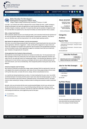
Click to see larger version
Oh yeah, I’ll work with my buddy Brian Solis who will take a new profile pictures, just haven’t had the time. Update: If you’re interesting in designing my banner, see the rules here on CROWDspring.
Leave your feedback below, myself and Mitch from StudioNashVegas are listening.

Hi,
I was looking for the search bar but there isn’t one, unless the [category] and [archeive] are very intuitive I’d consider putting a search bar back in either as a substitute or additional to.
Don’t think I need to state why search is an important rather popular content finding method:)
Julian
Mitch,
Referring to Julian’s comment, in terms of the user experience, I think the Search function should have a button with a “Search” label — just like the Search on your site.
Just a thought…
Two things I really like: 1) Connect with Jeremiah links and 2) I like how your latest tweet looks like a headliner
#2 has to be my fav, at first look it does not pop out at you, but once you notice it, it will definitely catch your eye first! Weird how that is.
If by feedback you mean problems then the one thing that troubles me with your lovely design is the too much text thing. I find it hard to concentrate and would perhaps find it easier if the headings were in the dark blue to break up the page.
I just realized that my attempt to say that I was working on a web site became a link for a web site that doesn’t exist. Sorry about that.
Like it overall. I gues one build is that I am not really interested in a section of flickr photos. If i want to see photos I will connect to your flickr or facebook page and check them out their. You might want to use that space for something else.
All the best,
Ivan
Thank you with sharing good information as web strategy redesign. Its really help full us. Also I have some more information about website redesign visit : http://www.seo-websitedesign.com.
Thank You.
Generally layout is flash but this layout is giving some good information.
Thank You
sports shoes
Nike Sport Shoes
Women's Nike Sport Shoes
Men's Nike Sport Shoes