Summary:
Yahoo’s new homepage is more like a feedreader and application platform for users to do more without leaving Yahoo.com. It’s a much needed update as Yahoo keeps up with the modern web, but think of it as evolution –not a revolution.
Last week, a handful of Forrester analysts were briefed and given a demo of Yahoo’s much needed homepage redesign –here are my observations from the demo and conversation.
Outdated Yahoo.com in need of redesign
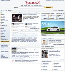
The old version of Yahoo is in serious need of a refresher as the main page navigation hampers users with two sections of tabs with even more content and links. For the most part, the content not as personalized, and no integration of social. Perhaps the biggest missed opportunity is the page is designed for people to click through –using it as a pass through only.
The 2009 Yahoo.com keeps users on site with Apps, NewsFeeds, and Real Time Info
Fortunatly, Yahoo, who serves many types of users offers a broad range of content to meet their needs, has moved forward to redesign their homepage to meet the needs of the changing web times. The new Yahoo page isn’t just about media and news, but is now integrating true functionality on the site by allowing applications to be embedded, and streaming real time searches and status updates, the key features in the redesign are:
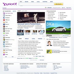
- Fresh, streamlined design. The page architecture has less clutter, cleaner lines, less content, and is more focused.
- Personalization of media content: Serving a large broad audience is different for any site, so Yahoo has included a slider that lets users choose if they want “fun” or “serious” content in their news feed. This should also cascade to other elements such as application.
- Application Platform: A platform that allows users to integrate applications into the experiences such as default features like Yahoo mail, but also content that is bookmarked automatically becomes an applet that has high level content from RSS in the left nav. Rolling over these sections exposes the information in snippet formats –increasing a users ability to quickly scan over information. This also makes Yahoo.com more sticky, as users can get more done –without leaving the page.
- Real time content surfaced “Zeitgeist”: The “Popular Searches” on top right show a living breathing update of what people are looking for. This is simlar to Twitter’s trending topics –and a great way for the people to define editorial content –not just Yahoo’s content team.
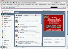
- Basic Social Feeds: Although it’s tucked away in a left favorites link, the “updates” link will allow a user to quickly see the content that their friends are producing. These lifestreams could signal latest tweets, Yahoo buzz, or other personal updates. Users will be able to integrate Twitter status updates,
- Mobile integration: Although I’ve not tried it, Yahoo has made promises to integrate this same experience with mobile devices, such as the iPhone.

Above: Yahoo’s outdated redesign was cluttered –click image to see my notes

Above: Yahoo’s new has a cleaner, more organized look –click image to see my notes

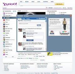
Above: Yahoo supplied me this screenshot of Facebook integration in the apps bar

Above: Lifestream show updates from your friends and contacts –a trend seen in Facebook, Twitter, and Friendfeed
Key Takeaways:
This redesign, while in the middle of speculation of a potential Microsoft relationship, impacts users, developers and brands, here’s what you should know:
- Yahoo follows modern web trends –but must evolve: Yahoo is following the trends in this space, where social updates from friends –and applications come front and center with this global redesign. We see these trends in Microsoft Live, Facebook, and Twitter, among other portal type news sites. The design isn’t without flaws, the newsfeed should be front and center –not just news and media to really take advantage of what people care about.
- Brands should use this as opp –as users spend more time on site: As the Yahoo homepage becomes more sticky, and users spend more time interacting on this page, this means new opportunities for brand marketers that want deeper impressions with users –beyond advertising. Expect brands to create applications designed for interaction on the Yahoo apps left bar –then promote them from a variety of locations.
- Yahoo must reach to developer community: For Yahoo to be successful, they must foster their developer community, tie into existing application platforms like Facebook developer community or OpenSocial, and integrate more social features.
- Improvement for users –and Yahoo: For Yahoo this isn’t a revolution, but an evolution it’s long lineage of Yahoo homepages, much deserved, and a step in the right direction. This redesign should help users sort out the information waterfall –and find the information they need without opening too many tabs.
Love to hear your feedback as a user, what do you notice and experience? Also, thanks to colleague David Card (Twitter, Blot Posts) who provided insight to this post.
Note: I had a typo, and corrected it, and also removed a screenshot at the request of Yahoo as this feature may not be live for everyone as it’s under testing.
sports shoes
Nike Sport Shoes
Women's Nike Sport Shoes
Men's Nike Sport Shoes