I’m having good success working with StudioNashVegas, and based on your feedback from a while ago, we’ve slowly made the changes you’ve suggested. Being a community guy, I’m working with you all to decide on what’s best for the upcoming redesign –of course, I factor in the feedback, but I make the executive call, or we’ll be doing death by committee.
While I’m 90% confident the comp is where I want it to be as far as user interface and information architecture, part of my work as a social analyst is to experiment with the different tools out there, so I’m going to use CROWDspring to outsource creation of my header. The designers will keep the logo, and will be given the dimensions to use for the header, more news on that soon (Update: here’s the details). This is a controversial topic, as I’ve written about why it’s here to stay, and I’ll be in one of the main stages at SXSW to debate it.
I’d like to get your feedback on this second iteration of the comp, I take your feedback seriously. Even if you see someone who’s said something similar to you, please chime in the comments, as I put weight on frequency of mentions.
Remember, it’s not just me that has to use this site, it’s as much a community resource, so I do value your feedback.
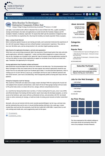
Click to see larger version
Oh yeah, I’ll work with my buddy Brian Solis who will take a new profile pictures, just haven’t had the time. Update: If you’re interesting in designing my banner, see the rules here on CROWDspring.
Leave your feedback below, myself and Mitch from StudioNashVegas are listening.
Hey Jeremiah,
I really enjoy your regular blogging, but I feel like there is significant value in your database of social networking stats. Having this and any other compilations you have available accessible from somewhere on the main page would be awesome. Personally I didn’t find out about it until I’d been reading the blog for nearly a month and you mentioned it in a post- it’s a great community resource you might want to display more prominently.
Other than that it looks great imo.
Good point Chris
I was thinking the ‘popular’ posts would be the archive for that, what do you think?
Hi,
I was looking for the search bar but there isn’t one, unless the [category] and [archeive] are very intuitive I’d consider putting a search bar back in either as a substitute or additional to.
Don’t think I need to state why search is an important rather popular content finding method:)
Julian
Julian,
The search bar is below the logo on the left side (on the same bar as the social-media icons, just on the opposite side)
Search is dire to a site’s long tail and with all of the good content in Jeremiah’s site, not having a search is like burying treasure under titanium.
Mitch (aka, the designer 😉
The new site template looks good. I will have to get a hold of StudioNashVegas to do my stuff (being a Nashvegas guy).
It’s looking great! A few nits:
-The font for “Subscribe” and “Connect” looks a little too playful. It might be the caps, might be the actual font.
-The icons (social networks and the magnifying glass) are all good, but IMO a little out-of-date. The style that seems to be predominant now is a simpler look. It’s pretty subjective, but if you wanted to hit that simpler look I’d ditch the glossiness and the flare on the magnifying glass.
LOVING the readability, the logo, and the Twitter stream at the top.
Mitch,
Referring to Julian’s comment, in terms of the user experience, I think the Search function should have a button with a “Search” label — just like the Search on your site.
Just a thought…
Really liking the look.
This may be a bit tangential, but I think the date on the side and the comment bubble being dominant is a bit awkward.
How does the comments page look? Are you including gravatar use, etc.?
Two things I really like: 1) Connect with Jeremiah links and 2) I like how your latest tweet looks like a headliner
#2 has to be my fav, at first look it does not pop out at you, but once you notice it, it will definitely catch your eye first! Weird how that is.
Michael,
That makes sense. I can put the text “search” into the search box to make it stand out without losing the effect of the graphical button (and of course, hitting enter works too).
Howard,
With Jeremiah’s blog, discussion is the key factor. He gets LOTS of comments, and his posts are (as I mentioned above) highly long-tail oriented. The date isn’t nearly as important as the comments, and so we’ve decided to switch them around. On a blog where content is more time-sensitive, then the date would be where the comments box is, but that’s not the case here.
Generally the layout is quite attractive, but a couple of things jump out at me: “Popular Posts” and “About” exist at the top and bottom AND in the sidebar. I would consider eliminating the top and bottom nav and incorporating “Contact” into the sidebar.
Speaking of the sidebar, after the “About” section, what’s the most important thing? Do you want people to peruse your Categories? Is that really the second most important? Or perhaps is Subscribing via Email the second most important? Consider ordering the sidebar by importance.
All the text in the sidebar is flush left except the About section. Unless that was done for a specific reason, it just feels odd. Consider putting your photo on the left side of the sidebar with the text on the right.
Good job so far. Can’t wait to see how it ends up. Good luck!
i really like this design. clean and crisp, nice graphics, nice layout. the font is good size and easily readable, something that can be overlooked. i especially like the incorporation of Flickr photos and job postings.
i’m not crazy about the logo right now, or the need to clikc through to see comments (unless i’m missing something).
overall, great job. thanks for sharing the process with us.
Evan
The icons are too playful? What am I just a old grouchy geezer? 😉
Thanks, now that you pointed it out, it may not be the ‘enterprise style’ I’m seeking.
Hey Jeremiah,
The design looks good overall…I have just a few comments on readability.
Your current site uses an average line length of 10-12 words, which is right in the sweet spot for easy scanning and quick reading. This is a standard that was used frequently in the print world when laying out text (and has been forgotten in this world of variable text sizes and browsers). The line lengths on the new design have gotten longer: looks like an average of 17-19 words. This makes the text a bit harder to scan, as my eye has to jump a bit further to the left to get down to the next line. Compare the two, see what you think…
Secondly, i disagree that the subscribe and connect font is too playful- it’s clean, straightforward, and conversational, totally on-brand for you. One thing i will mention is to be careful of using all-caps too much…it takes longer for the eye to decipher a word in all caps rather than upper and lower case. More size and shape variation = faster read. It’s not a hard and fast rule, and in MHO it’s less of an issue than the line length. Just be aware of it.
The logo at the top, all by itself pushes everything down the page and below the fold by around 100 pixels…I’m not sure it returns that much to the design to warrant pushing some content out of sight. Also, the search box placement does compete with the logo mark…they fight each other and compete for attention. It’s kind of like you’ve dedicated this big gray bar shape to set off the logo, and then you neutralize it by squeezing a search box right under it. I’d move the search box.
Overall tho, it looks good, and i love reading your stuff…thanks.
If by feedback you mean problems then the one thing that troubles me with your lovely design is the too much text thing. I find it hard to concentrate and would perhaps find it easier if the headings were in the dark blue to break up the page.
I’m in the midst of redesigning my blog too, interesting to read the commentary here. I’m also going with a wider post column, in my case because I embed a lot of stuff (mostly video) and these days it’s often wider than 480px. HE video embeds look great a skootch bigger…I’m going with 540 or 560.
It’s a very clean layout, which is great. Ok, am dating myself here, but I think the fonts (which I like)are too small and the blue could be a shade or two darker. This will be true for most eyes over age 40. Also, it might help to have the email subscription block closer to your other various feed, subscription and site icons. I would put the Feedburner and Twitter counters closer to your affiliations and rankings. Finally, I would consider having the monthly archives for just one year and then have a link for each of the prior years. It would give you more white space and would quickly show you’ve been blogging for several years, further reinforcing your credibility. Great stuff.
I just realized that my attempt to say that I was working on a web site became a link for a web site that doesn’t exist. Sorry about that.
Jeremiah,
The popular post section could work, but I’m a fan of a small tab on the right for “social networking stats 09” or something of that sort.
Like it overall. I gues one build is that I am not really interested in a section of flickr photos. If i want to see photos I will connect to your flickr or facebook page and check them out their. You might want to use that space for something else.
All the best,
Ivan
I wanted to thank everyone for these comments, I’m reading them all.
The points from Dan and Kate on readability and use of text and fonts really stuck out. I’ll chat with Mitch about this.
IMO, the right hand column is pretty busy, and the icons at top will date a little. Otherwise good first crack.
Thanks Bank Channel
I’d like to chime in with my two cents.
At imc2, our information architects always have the Forrester methodology top of mind when conducting site reviews. Given that, one thing that jumps out is your inconsistent use of interactive elements (links in this case). Are they underlined, in parentheses, using double pointers before or after the link?
Next, you might want to consider organizing features with similar function in the same area. You could move the search box under Popular Posts in the header; Julian missed it in its current location.
Finally, you have room for a tagline explaining the purpose of your site in the header, like on this site. Web Strategy is a wide area of discussion these days and first time readers want to be able to tell quickly if this site aligns with their interests.
Hope it helps!
Dan
Who the hell listens to Forrester? 😉
interesting topic post i am still pretty new to blogging and web design
so different prospectives are always worth a read
regards John
Thank you with sharing good information as web strategy redesign. Its really help full us. Also I have some more information about website redesign visit : http://www.seo-websitedesign.com.
Thank You.
Generally layout is flash but this layout is giving some good information.
Thank You
sports shoes
Nike Sport Shoes
Women's Nike Sport Shoes
Men's Nike Sport Shoes