I’m practicing what I preach to clients, and am adopting one of the five objectives we call “Embracing” which is when brands use social technologies to collaborate with their customers to create new products. In this case, the product is my blog, and the customers are you, my community.
I’m undergoing a blog redesign, and after deciding on designers (read the process) I’m working with Mitch from studionashvegas. We’ve done several comps on my redesigned logo, which is now finalized, but am looking for feedback from YOU, my readers on the blog redesign.
I study community, and this blog needs to serve your needs as well as mine. I know who my audience is from real research (see stats), it’s primarily interactive marketers at agencies, corporate, and consultants. Since I’ve outgrown this current design, see the overflowed right nav, it’s time to clean up the layout, make it easier to find information and highlight what I think is important.
Although we’ve taken a few comps to get to this point, here’s the latest version we’re willing to share. Since you’re going to be looking at this design as a community member, I want your feedback, and am watching for patterns in suggestions, or what you like.
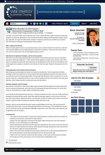
Click image to see large version
We’re also having the same discussion on Friendfeed. Here’s to making a great blog to suit our needs as a community, love to hear your opinion, please leave a comment below.

Since you are revamping your entire site I think you should update your picture as well.
Looks good.
Would like to see more video/audio on your site –text is becoming old(er) school. It take more work, but is worth it.
Small comments.
– think about what you want your brand to be. isn’t a 100% clear.
– what’s the difference betw Vault and Archives? Naming is too similar
– its good you have RSS feed and the FaceBook, Linked In chicklettes high on the page, but maybe some text explaining them. Newbies might not get it. Depends though on your audience.
– I don’t want to scroll to Subscribe Via email
– how about adding ratings
– we are using user voice (thanks to you) and like it, so maybe have an ongoing dialogue with your readers about how to improve the blog.. ongoing rating and comments (keep it organic)
– how will popular posts (and comments, if you have them be determined). seems like it is just stuck there on the page
— too much wasted space in the header.
That’s it for now. Willing to look at other designs.
Thanks for all your great work and information in 2008. Definately made my job easier,
Scott Wilder
Intuit
More important than any of the below (I’ve done a lot of web design work – these are just quick thoughts):
It’s the content – I rarely look at the website – RSS feeds all the way.
On my widescreen fairly small laptop, there is simply too little content “above the fold”. But this is my biggest complaint with the current layout as well.
I really dislike the left-aligned “About J.” text; it removes the negative space divider between the right-column and the main column that is present currently and makes it feel much more cluttered than it is. I would either right-align that section or swap it and your picture to re-create that line. I can explain this from a design standpoint more if you want; the human eye needs clean negative space.
In general, I dislike having paragraph break spacing be a full stop tall, and you may have it as much as 1.3 or 1.5x tall; try two-thirds or half the width of the text and I think you’ll find it flows much better. (your current layout probably is a full stop; the new one is more and thus worse).
One idea: how about putting the “about” and maybe the picture in the big block of fairly useless space that is the sentence inside {…}? It’s too much wasted space in too good a spot. There’s nothing to keep the eye there.
Like someone else said, I don’t know what the difference is between “vault” and “archive”. It should be more clear.
If you aren’t using twitter anymore, it shouldn’t be the top thing on your page.
A positive: I like the new logo.
I don’t like the way the date is displayed; it feels tacky/amateurish. A clean date byline “12 November, 2008” would suit you better. (Think AP style)
I agree with someone above that you should consider getting a new picture; nothing wrong with this one, but you can probably do better, and your face is part of your brand.
There should be a clear, above the fold link to your tags for your posts so they are easy to access (or they should scroll down the side like they do now).
I’d be happy to discuss more in detail at any point – It’s an interesting effort; sorry I’m not a big fan.
-Zack Reiss-Davis
(NOTE: I meant I’m not a big fan of the new layout)
sports shoes
Nike Sport Shoes
Women's Nike Sport Shoes
Men's Nike Sport Shoes
Hi
Are you tired of paying your writers hundreds of dollars every month?
We know getting high-quality content is a painstakingly slow and expensive process.
Introducing Typli.ai, a futuristic AI-powered tool that makes content generation a piece of cake!
Generate unlimited content with the click of a button, and keep doing so without being limited by a token or credit system. Create 10, 100, or even 1000 articles in a single day, USE IT THE WAY YOU LIKE!
Typli.ai uses extremely sophisticated machine learning algorithms to remove the fill-in-the-blanks system and needs just a SINGLE PROMPT from you to write an ENTIRE BLOG for you.
Grab this with an Exclusive offer at 1/3 of the usual price! —- http://bit.ly/3JoICSZ