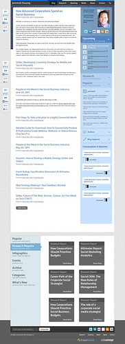
This will be the fourth, (or wait, fifth? I can’t keep track over the years…) design iteration of the Web Strategy blog, and I’m pleased to share an upcoming sneak peek comp.
Overall, we leaned on a focus on accessing information quickly –rather than a complete new look, you’ll notice many of the same familiar UI elements, but with greater access to reports, graphs, and popular posts that may be ideal to reference.
We’re thankful for your feedback (we listened, responded, and factored it in) so I really want you to know how important your feedback is. If you’ve any other final comments, kindly leave a comment below. Thanks to the Engage Sciences web design team for their assistance, and for WordPress Expert (he really knows his stuff) StudioNashVegas who’ll start production shortly, and we’ll have a staging site up for testing.
A few design notes on how I plan to serve you better:
- You’ll see a mixture of the best features from comp 1 and 2 (link above)
- Reduced dead space like header and banner –just get to the point dangit!
- We’re gonna try something new and show a waterfall of posts, so the most recent post will have more content, but older posts will display less –in order to prevent excess scrolling.
- I’m surfacing events higher up, as a big part of my business is professional speaking and webinars, I’d like to further promote them
- Lastly, because this blog is often used as a reference to find research, stats, lists, webinars, we’ve created a library-like section at the bottom for faster indexing and ability to quickly retrieve beyond search methods.
Below, if you click on this screenshot, you’ll see the life size version, I look forward to any comments you have below, your reactions?

I actually like the social media icons at the top and the bottom. Kudos for a thoughtful and helpful redesign.
great!!
Big improvement ” from both the current site and the earlier comps. The color palette is more comforting. The type feels more “you.” The styling and formatting seems very buttoned-up. The increased column padding gives your copy room to breathe. Even the simple/1-color icons (sidebar) are an improvement. It just feels more cohesive.
Only suggestions:
1) Possible readability concern in the blue text on blue background areas (mainly the “Research”/”Popular” tabs)
2) I’m a blue fan too, but I think the page could use a complementary/triadic accent color. Maybe something in the #FFFFCC ” #999966 range? Even just sprinkling in some more of the “charcoal” color in the top half of the page should help.
The picture you had some time ago was way better, the articles part, the core one in my opinion, is not the best in the whole layout.