Sneak Preview: Upcoming Blog Redesign

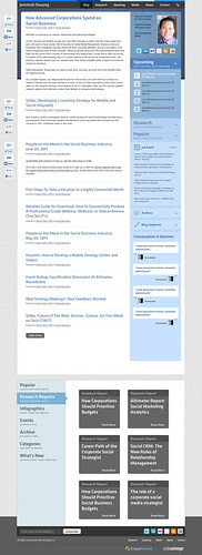
This will be the fourth, (or wait, fifth? I can’t keep track over the years…) design iteration of the Web Strategy blog, and I’m pleased to share an upcoming sneak peek comp.

Overall, we leaned on a focus on accessing information quickly –rather than a complete new look, you’ll notice many of the same familiar UI elements, but with greater access to reports, graphs, and popular posts that may be ideal to reference.

We’re thankful for your feedback (we listened, responded, and factored it in) so I really want you to know how important your feedback is. If you’ve any other final comments, kindly leave a comment below. Thanks to the Engage Sciences web design team for their assistance, and for WordPress Expert (he really knows his stuff) StudioNashVegas who’ll start production shortly, and we’ll have a staging site up for testing.

A few design notes on how I plan to serve you better:

  • You’ll see a mixture of the best features from comp 1 and 2 (link above)
  • Reduced dead space like header and banner –just get to the point dangit!
  • We’re gonna try something new and show a waterfall of posts, so the most recent post will have more content, but older posts will display less –in order to prevent excess scrolling.
  • I’m surfacing events higher up, as a big part of my business is professional speaking and webinars, I’d like to further promote them
  • Lastly, because this blog is often used as a reference to find research, stats, lists, webinars, we’ve created a library-like section at the bottom for faster indexing and ability to quickly retrieve beyond search methods.

Below, if you click on this screenshot, you’ll see the life size version, I look forward to any comments you have below, your reactions?

Web Strategy Blog Redesign, Q3, 2011

39 Replies to “Sneak Preview: Upcoming Blog Redesign”

  1. Yeah, I’m sorry, this is an unacceptable blog redesign. I actually like it, which means you must be doing something wrong because with a blog redesign your readers are supposed to hate it. I mean, where’s the horrible 8 bit logo?  

  2. It looks fantastic, but I would think with the sidebars & footer (presumably each section shows links to the other items) you will end up with 300-400 links.  In general you should strive for the average to be around 100 or lower for SEO.

    Other than that – I love the design from a design standpoint.  Very clean and easy to read/understand.  Their is only 1 design element I find garish social media icons on the right of the first 3 posts. That’s one area the TechCrunch design probably excels.  Some sort of social media share count at the top of each post that when you hover over shows each social media share options/count separately would probably work better for your more business minded audience.

  3. I actually like the social media icons at the top and the bottom. Kudos for a thoughtful and helpful redesign.

  4. Very clean design, Jeremiah! I love the reference area. That will certainly be useful for your readers and help them to quickly find relevant information. How about adding a “Video” section to the reference area, highlighting posts that contain video?

  5. It looks great. I really like the expandable menus in the right rail, and the left rail sharing icons are nifty. I’ve seen that 3 times now this week. Seems to be the new vogue for placement of those elements. Danny Brown is doing it that way too. 

    Only piece I don’t like is placement of the email sign-up in far lower left. That’s a really pathetic piece of real estate for a call-to-action, IMHO. 

    Bravo to you and the team! Nice stuff. 

  6. I like the reference library. Great to check on things you might have missed. Branding is one of my beats, and I’m sorry you did away with the banner. If you are already a follower, then maybe it’s not as important. But you are getting new visitors everyday who might not be as familiar with you or Altimeter so I think the design is rather “timid.” Maybe there is some sort of compromise where you would have a more impactful header.

  7. I like the reference library. Great to check on things you might have missed. Branding is one of my beats, and I’m sorry you did away with the banner. If you are already a follower, then maybe it’s not as important. But you are getting new visitors everyday who might not be as familiar with you or Altimeter so I think the design is rather “timid.” Maybe there is some sort of compromise where you would have a more impactful header.

  8. – No ads! Cool!

    – You might make fewer previous posts in the list of posts.

    – Fewer “Upcoming” (events) and Job Board listings – with a link to More at the bottom of each of those sections.

    Otherwise, awesome!

  9. – No ads! Cool!

    – You might make fewer previous posts in the list of posts.

    – Fewer “Upcoming” (events) and Job Board listings – with a link to More at the bottom of each of those sections.

    Otherwise, awesome!

  10. It appears to be great. I like the expandable menus in the right rail,
    and the left rail sharing icons are useful. I have seen that three
    times now this week. Appears to be the new style for placement of those
    elements. Danny Brown is doing it that much too.

  11. It really hurted me a lot with time and energy while I migrated my
    comments to disqus. I think your help is really appreciated. Thanks for
    posting.

  12. I love it. The look and feel are so compatible with what you have now that it will be a totally smooth transition for any followers. Great job!

  13. Big improvement ” from both the current site and the earlier comps. The color palette is more comforting. The type feels more “you.” The styling and formatting seems very buttoned-up. The increased column padding gives your copy room to breathe. Even the simple/1-color icons (sidebar) are an improvement. It just feels more cohesive.

    Only suggestions:
    1) Possible readability concern in the blue text on blue background areas (mainly the “Research”/”Popular” tabs)
    2) I’m a blue fan too, but I think the page could use a complementary/triadic accent color. Maybe something in the #FFFFCC ” #999966 range? Even just sprinkling in some more of the “charcoal” color in the top half of the page should help.

  14. Thanks Jeannette, I’m hoping my work will speak for itself.  Our reports and slideshares are branded so hopefully those will work.  The goal is for the content to be a reference then spread.

  15. You’ve got a right point regarding the mascot. It’s usually part of companies. I would suggest however a short fan comic. I placed one in my business blog and i received many positive mails from my prospects.

  16. You’ve got a right point regarding the mascot. It’s usually part of companies. I would suggest however a short fan comic. I placed one in my business blog and i received many positive mails from my prospects.

  17. The picture you had some time ago was way better, the articles part, the core one in my opinion, is not the best in the whole layout.

  18. Jeremiah – I agree with those saying it’s a big improvement, and also that I like the clean look & feel.

    I think it’s a big improvement that the content is broken down into sub-sections, and the breakdown at the bottom is also excellent.

    Couple of thoughts – I personally think the ‘bald’ statement at the top: “Jeremiah Owyang” doesn’t work as well as “Web Strategy by Jeremiah Owyang”, but I’ll probably get used to it, and the reason I return is to view the content. I agree with getting shot of the padding, but a little more padding would suit me better 😉

    Second thought was – how can I navigate to the bottom breakdown more readily? How about a link or a separate page with this graphical navigation?

  19. Jeremiah – I agree with those saying it’s a big improvement, and also that I like the clean look & feel.

    I think it’s a big improvement that the content is broken down into sub-sections, and the breakdown at the bottom is also excellent.

    Couple of thoughts – I personally think the ‘bald’ statement at the top: “Jeremiah Owyang” doesn’t work as well as “Web Strategy by Jeremiah Owyang”, but I’ll probably get used to it, and the reason I return is to view the content. I agree with getting shot of the padding, but a little more padding would suit me better 😉

    Second thought was – how can I navigate to the bottom breakdown more readily? How about a link or a separate page with this graphical navigation?

  20. Jeremiah – I agree with those saying it’s a big improvement, and also that I like the clean look & feel.

    I think it’s a big improvement that the content is broken down into sub-sections, and the breakdown at the bottom is also excellent.

    Couple of thoughts – I personally think the ‘bald’ statement at the top: “Jeremiah Owyang” doesn’t work as well as “Web Strategy by Jeremiah Owyang”, but I’ll probably get used to it, and the reason I return is to view the content. I agree with getting shot of the padding, but a little more padding would suit me better 😉

    Second thought was – how can I navigate to the bottom breakdown more readily? How about a link or a separate page with this graphical navigation?

  21. Very clean design, Jeremiah! I love the reference area. That will
    certainly be useful to your readers and help them quickly find relevant
    information. How about adding a “Video” to the reference area,
    highlighting messages that contain video?

Comments are closed.